
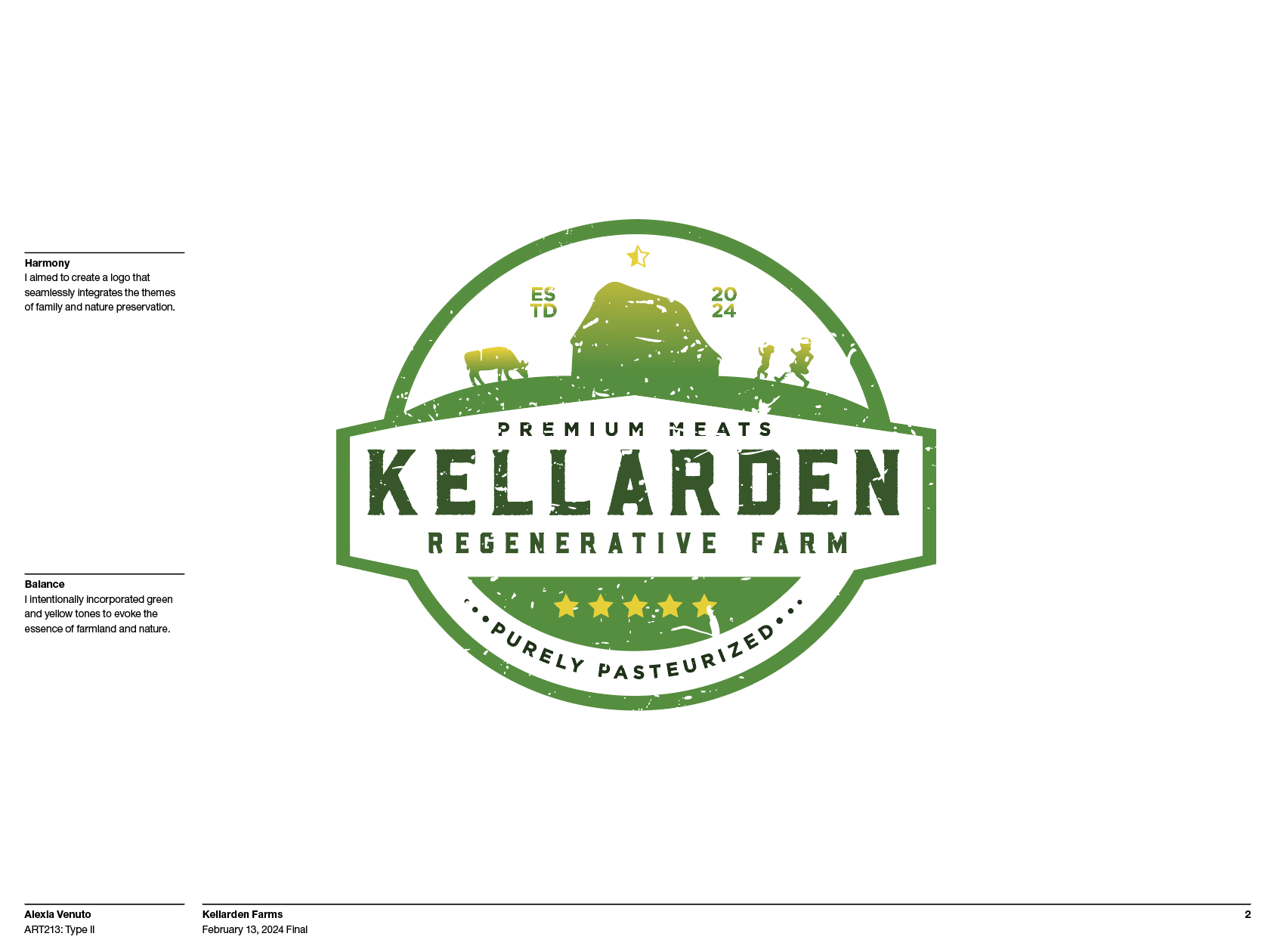
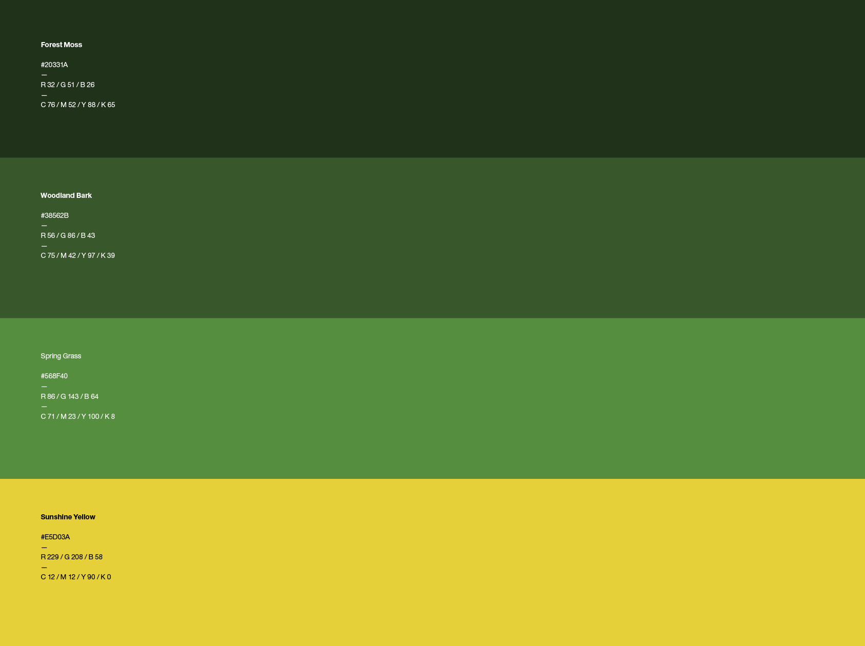
For this project, we were assigned the exciting task of designing a brand logo for a promising new company, Kellarden Farms. The owner envisioned a logo that would capture the essence of a family-friendly and nature-centric farm, and I sought to bring this vision to life through my thoughtful design choices. To achieve this, I carefully selected a gradient color scheme that transitions through shades of green and yellow, evoking the warmth and growth associated with the farm's values. Additionally, I opted for a circular emblem shape, which symbolizes unity, community, and the continuous cycle of nature. By integrating these elements, I aimed to create a logo that not only reflects the farm's core principles but also appeals to families and nature enthusiasts alike.

Spring 2024